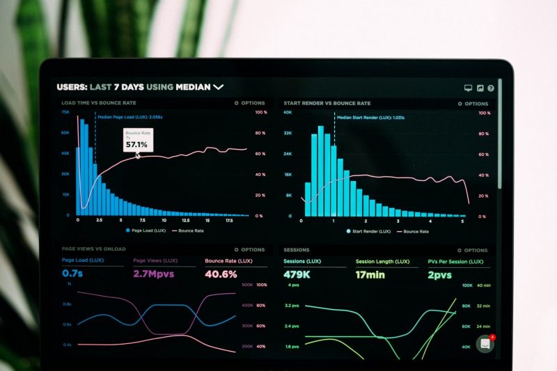
Although we tried to give you a simple but detailed guide on where to start, here are some quick and basic tips you may want to keep in mind:
- Be clear about what you’re trying to achieve – your board’s purpose will inform its design
- Only include what’s important – everything should support your board’s intent
- Use size and position to show hierarchy – make it clear to the viewer what’s most important
- Give your numbers context – help your viewers know if a number’s good or bad
- Group your related metrics – make your metrics easy to find
- Be consistent – using the same visualizations and layouts makes comparing easier
- Use clear labels your employees will understand – keep them short and self-explanatory
- Round your numbers – too much detail could make minor changes seem major
- Keep evolving your dashboards – check that your dashboard is encouraging the right behaviour
Data representation
Data representation is a complex task and can be quite challenging. Choosing the wrong chart type may confuse users or lead to data misinterpretation. So here are the most commonly used ones, and some tips to get a general idea:
- Scatter charts are primarily used for correlation and distribution analysis. Bubble chart helps introduce the third dimension into the chart.
- A network diagram is handy when even the most minor connection between data points are very important.
- Pie and Donut charts have a bad reputation for data visualization. These charts are among the most frequently used, and also the most frequently misused. They are quite difficult to read when there are too many components or very similar values.
- Distribution charts help you to illustrate outliers, the normal tendency, and the range of information in your values.
- DON’Ts: Gauges and traffic lights were a big trend in dashboards in the past, but have come to an end. 3D and overstyled charts (like those with too many icons, etc) have lower readability, distract the viewer from data, and even more difficult to develop, so there is little reason to use them.

Take a look at your internal reports, probably you’ll get some inspiration there, and if not, here are some questions to help you out:
- How many variables do you want to show in a single chart?
- Will you display values over a period of time, or among items or groups?
- How many data points are needed to display for each variable?
Data consistency
This includes naming, formatting, values and design. As the main goal of the dashboard is to get the message across at a glance, nothing is worse than a possible distraction. If your data is named the same way in each tool, it will be easier for you and any other user to see clearly.
Priorities and rationalization
Make a little effort and create a basic structure or a skeleton for your design which will help you see the co-relation, hierarchy and an overall “system” between the elements. That’s crucial for dashboard design as it is meant to organize a ton of information in a seamless way.
– The top left corner of the screen will naturally get more attention the key info should be positioned from left to right. Also readers tend to move on down from the first row to the next one. If there are dependencies between the parts of your dashboard, create a continuous flow so that users do not need to go back and forth.
– Blocks (or cards) system helps you group elements and separate those groups from other ones. Cards are easy to arrange, almost infinitely manipulatable and easily scaled up or down. It’s crucial to keep the consistent layout of controls and data inside those cards (name in the top left corner, align view controls or actions to in the top right corner of the card, the rest for the content).
– Increase your margins. White space, also known as negative space, is the area between elements in a design composition and it matters as much as any other typography element. Keep enough “air” between your layout blocks.
– Don’t rely on interactions with the information blocks. “Read more”, several tabs, long-scrolled boards – this all makes it more likely that only the superficial part of the information will be discovered. The opposite common mistake is try to fit all and everything in the main screen which leads to overwhelming a user. The solution is prioritization. Identify core information, summarize, synthesize and surface only key info.
Personalization rather than customization.
Users expect that the content they see will be relevant to their individual needs. Personalization is done by the system itself. The system should be set to identify users and deliver to them the content, experience, or functionality that matches their role. Customization is done by the user. Giving him more power to customize the dashboard is a good initiative, as long the view is already personalized. But it is often an excuse to avoid a tedious process of truly finding out what each user role truly needs to see. And in the end the inexperienced user is left on his own.
Well, this seems to be pretty much it.
And don’t forget: as exciting as it may seem, the DESIGN is the last thing to do, after having all your goals and KPIs correctly identified.


